Data visualization is no longer just about creating pretty charts; it’s about telling a compelling story with your data. The right data visualization tool transforms raw, complex datasets into interactive, understandable insights that drive strategic business decisions. By representing data graphically, you can spot trends, identify outliers, and communicate findings far more effectively than with spreadsheets alone.
With countless data visualization software options available, choosing the right one can be overwhelming. Some are powerhouse business intelligence (BI) platforms designed for deep enterprise analytics, while others are nimble libraries for developers or easy-to-use tools for marketers.
This guide breaks down the 8 best data visualization tools for 2026, categorized by their primary use case, to help you find the perfect fit for your needs.
Quick Comparison: Top Data Visualization Tools of 2026
| Tool | Type | Best For | Starting Price (Approx.) |
| Tableau | Business Intelligence Platform | Enterprise-level interactive analytics | $75/user/month (Creator) |
| Microsoft Power BI | Business Intelligence Platform | Businesses invested in the Microsoft ecosystem | $10/user/month (Pro) |
| Looker (Google Cloud) | Business Intelligence Platform | Data teams needing a governed, scalable platform | Custom (Quote-based) |
| Qlik Sense | Business Intelligence Platform | Associative data exploration & embedded analytics | $20/user/month (Business) |
| TIBCO Spotfire | Business Intelligence Platform | Scientific, geospatial, and advanced analytics | Custom (Quote-based) |
| D3.js | JS Library | Developers needing complete customization | Free (Open Source) |
| Highcharts | JS Library | Developers needing fast, responsive charts | Free for non-commercial, licenses start ~$500 |
| Plotly (Dash) | Library/Platform | Data scientists (Python/R) and web app development | Libraries are Open Source; Dash Enterprise is quote-based |
Part 1: Business Intelligence (BI) Platforms
These are comprehensive, all-in-one solutions designed for data connection, analysis, visualization, and sharing across an organization.
Tableau: The Gold Standard for Interactive Analytics
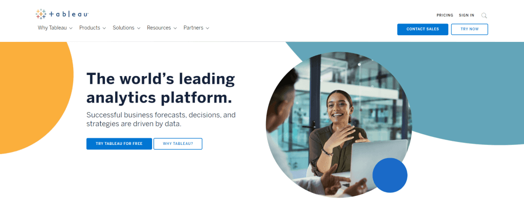
Acquired by Salesforce in 2019, Tableau remains a leader in the BI space, celebrated for its intuitive drag-and-drop interface and stunningly beautiful visualizations. It empowers users of all skill levels to explore data and create interactive dashboards.
- Best For: Organizations of all sizes that prioritize powerful, user-friendly, and highly interactive data exploration.
- Key Features:
- Connects to hundreds of data sources, from spreadsheets to big data platforms.
- Powerful drag-and-drop dashboard builder.
- Advanced mapping and geospatial analysis capabilities.
- Robust community and extensive learning resources.
- Natural Language Processing with “Ask Data.”
- Pricing: Starts at $75/user/month for the “Creator” license. Viewer licenses are available for less.
Our Expert Take: Tableau’s strength is its unparalleled user experience for creating interactive visuals. While the price point is higher than some competitors, no other tool makes deep data exploration feel this intuitive. Its integration with Salesforce CRM is a major advantage for sales and marketing teams.
Microsoft Power BI: The Microsoft Ecosystem Powerhouse

Power BI is Microsoft’s answer to Tableau and a leader in Gartner’s Magic Quadrant for Analytics and BI Platforms. Its biggest advantage is its seamless integration with the entire Microsoft stack, including Excel, Azure, SQL Server, and Microsoft 365.
- Best For: Businesses already heavily invested in the Microsoft ecosystem, especially those using Azure and Excel for data management.
- Key Features:
- Deep integration with Excel, allowing for easy data import and analysis.
- Powerful data modeling capabilities with DAX formula language.
- AI-powered features like Q&A and Quick Insights.
- Strong enterprise-level data governance and security.
- Pricing: Offers a free desktop version. Power BI Pro is highly affordable at $10/user/month, with Power BI Premium for larger deployments starting at $20/user/month.
Our Expert Take: Power BI is the undisputed value king in the BI world. For any organization running on Microsoft products, its affordability and native connectivity make it a no-brainer. The learning curve for its data modeling language (DAX) can be steep, but the payoff is immense. Note that the full-featured desktop application is Windows-only.
Looker (Google Cloud): The Modern BI & Analytics Platform
Acquired by Google in 2020, Looker takes a different approach. It is a browser-based platform that uses its own modeling language, LookML, to create a reusable and governed data logic layer. This makes it incredibly powerful for ensuring consistency across all company reports.
- Best For: Data-driven companies that need a scalable, governable, and embeddable analytics platform with a single source of truth.
- Key Features:
- LookML modeling layer for creating reusable data definitions and business logic.
- Fully web-based interface.
- Seamless integration with Google Cloud services like BigQuery.
- Powerful API for embedding analytics into other applications.
- Pricing: Custom quote-based. Generally targeted at mid-market and enterprise companies.
Our Expert Take: Looker is built for data teams. While business users can easily explore data, the real power comes from the centralized LookML model that engineers maintain. This “governed self-service” approach prevents the chaos of inconsistent metrics that can plague other BI tools. It’s the best choice for building a reliable data culture.
Qlik Sense: The Associative Exploration Engine
Qlik Sense is the modern evolution of its predecessor, QlikView. Its key differentiator is the “Associative Engine,” which allows users to explore data in any direction without the constraints of linear, query-based models. It highlights not just related data, but unrelated data as well, often revealing hidden insights.
- Best For: Users who need to freely explore data relationships and discover unexpected connections.
- Key Features:
- The patented Qlik Associative Engine for multi-directional data exploration.
- AI-powered insight suggestions and conversational analytics.
- Strong capabilities for embedded analytics within other apps.
- Centralized management for apps, data, and users.
- Pricing: Starts at $20/user/month for Qlik Sense Business.
Our Expert Take: If Tableau is about guided storytelling, Qlik is about unguided data discovery. The “gray, white, and green” selection logic is unique and incredibly powerful for spotting what’s not in a dataset. It’s a fantastic tool for users who want to ask their own questions without being limited by a pre-built dashboard path.
TIBCO Spotfire: The Choice for Scientific and Advanced Analytics
TIBCO Spotfire has long been a favorite in scientific and engineering fields like energy, manufacturing, and pharmaceuticals. It excels at handling complex, multi-variate data and offers robust features for predictive analytics, geospatial analysis, and real-time data streaming.
- Best For: Data scientists, engineers, and researchers working with complex scientific, location, or IoT data.
- Key Features:
- Advanced geo-analytics and map visualizations.
- Built-in predictive modeling and data science tools (integrates with R and Python).
- Real-time streaming data visualization.
- Powerful data wrangling and preparation capabilities.
- Pricing: Custom quote-based pricing.
Our Expert Take: While Power BI and Tableau dominate the general business market, Spotfire holds a strong position in technical industries. If your work involves complex statistical analysis, location intelligence, or real-time sensor data, Spotfire offers specialized capabilities that other mainstream tools can’t match.
Part 2: Developer-Focused Charting Libraries
These are JavaScript libraries that give developers granular control to build completely custom, web-based data visualizations. They require coding knowledge.
D3.js: The Ultimate in Customization

D3.js (Data-Driven Documents) is not a tool, but a powerful and flexible JavaScript library for manipulating documents based on data. It gives you full control over the final result by binding arbitrary data to a Document Object Model (DOM) and then applying data-driven transformations.
- Best For: Developers who need to create bespoke, innovative, and highly interactive data visualizations from scratch for web applications.
- Key Features:
- Unmatched flexibility and control over every visual element.
- Leverages web standards (HTML, SVG, CSS) without a proprietary framework.
- Massive community and a vast gallery of examples.
- Focuses on data binding to DOM elements.
- Pricing: Free and open-source.
Our Expert Take: D3.js is the “build it yourself” option. It has a steep learning curve but offers infinite possibilities. You aren’t limited by a tool’s pre-set chart types. If you’ve seen a unique, cutting-edge data visualization on a site like the New York Times, it was likely built with D3.js.
Highcharts: The Fast and Responsive Charting Library

Highcharts is another popular JavaScript library that focuses on making it easy for developers to create beautiful, responsive, and accessible charts. Unlike D3.js, it’s a high-level library that provides pre-built chart types, making development much faster.
- Best For: Developers who need to add standard, interactive charts (line, bar, pie, etc.) to a website or application quickly and reliably.
- Key Features:
- Wide range of available chart types out of the box.
- Excellent documentation and API.
- Focus on cross-browser compatibility and accessibility.
- Does not require external plugins like Flash.
- Pricing: Free for non-commercial use. Commercial licenses start around $535 for a single developer.
Our Expert Take: The draft incorrectly stated Highcharts was free for all uses. It’s crucial to understand its licensing. For business projects, you need a paid license. Highcharts is our go-to recommendation for developers who value speed and reliability over the infinite customization of D3.js.
Plotly (and Dash): The Data Scientist’s Choice

Plotly is an open-source graphing library available for languages like Python, R, and JavaScript. It’s extremely popular in the data science community for creating publication-quality charts within analytical workflows. Plotly also offers Dash, a framework for building full-fledged analytical web applications using pure Python or R and no JavaScript required.
- Best For: Data scientists and analysts using Python or R who want to create interactive visualizations and web apps without leaving their primary coding environment.
- Key Features:
- Seamless integration with Python (Pandas, NumPy) and R environments.
- Creates interactive, D3.js-powered charts.
- Dash framework allows for building complex dashboards with dropdowns, sliders, and callbacks.
- Plotly Enterprise provides deployment and collaboration features.
- Pricing: Open-source libraries are free. Plotly Dash Enterprise is a paid, quote-based product.
Our Expert Take: Plotly bridges the gap between static analysis in a Jupyter notebook and a fully interactive web application. The ability to build a powerful dashboard using only Python with Dash is a game-changer for data science teams, significantly reducing development time.
Conclusion: How to Choose the Right Data Visualization Tool
The “best” data visualization tool depends entirely on your specific needs, skills, and budget.
- For enterprise-wide business intelligence and self-service analytics, Tableau and Microsoft Power BI are the undisputed market leaders.
- For a governed, scalable data platform, especially for tech-forward companies, Looker (Google Cloud) is a superior choice.
- For developers needing custom web visuals, D3.js offers ultimate flexibility, while Highcharts provides speed and simplicity.
- For data scientists working in Python or R, Plotly Dash is the perfect solution for building interactive analytic apps.
- For marketers and non-designers, Canva is the fastest way to create stunning infographics and reports.
We recommend shortlisting two or three tools from this list and taking advantage of their free trials. There is no substitute for hands-on experience to see which platform best fits your data and your team’s workflow.
FAQs
What is a data visualization tool?
A data visualization tool is software that converts raw data from sources like spreadsheets or databases into graphical representations such as charts, graphs, maps, and dashboards. This makes complex data easier to understand and analyze.
What’s the difference between a BI tool and a charting library?
A Business Intelligence (BI) tool (like Tableau or Power BI) is a complete platform for connecting to data, performing analysis, and creating shareable dashboards. A charting library (like D3.js or Highcharts) is a programming toolset that developers use to build custom charts within a website or application.
Can I use these tools with Excel?
Yes, virtually all BI platforms and infographic makers have excellent integration with Microsoft Excel, allowing you to easily import data from
.xlsor.csvfiles.Are there any completely free data visualization tools?
Yes. D3.js and Plotly’s open-source libraries are free for developers. Microsoft Power BI offers a very capable free desktop version for individual use. Canva also has a generous free tier for creating infographics.
What skills do I need to use these tools?
It varies. Tools like Canva are designed for beginners with no technical skills. BI platforms like Tableau and Power BI have a moderate learning curve but are accessible to business users. Libraries like D3.js are for experienced web developers only.